BBC News Labs — Accessible Narrative Text
June 25, 2020
Your Mission, should you choose to accept it…
In the Summer of 2018 we responded to a tender request from the BBC, who were looking to prototype a system that could make Narrative Text accessible to screen reader users.
"But what is Narrative Text?" I hear you ask. Similar to subtitles or captions, Narrative Text displays a fancily styled text description over video. It usually augments the narrative by setting the scene or describing something that is happening in the video. Unlike subtitles, Narrative Text is usually styled following organisational branding guidelines.
The fanciness part is key. Because of the strong visual styling and often animation, Narrative Text is usually ‘burned in’ to videos, thereby making it invisible to screen readers — which is clearly a Bad Idea™!
The BBC had just undertaken a (very fancy) organisation-wide rebranding, which was also applied to their Narrative Text templates, and BBC News Labs were keen to evaluate making it accessible. Enter Bad Idea Factory. The only problem was that this was a good idea!
But why then would Bad Idea Factory work on this? Our initial thoughts were that this was a problem that was virtually impossible to solve. That is to say – elements of it were possible using workarounds, but to make the actual styled text accessible in such a way that it could be dynamically generated, screen-readable and of acceptable and consistent stylistic quality – all of this using web technology? Yeah – that might be a little tricky.
And to create a complete workflow from (the BBC’s editing suite of choice) Final Cut Pro X to web was clearly delusional and surely doomed to failure. So that is what we set to work on.
Clearly Delusional
Our broad approach was to take the Final Cut Pro XML (FCPXML) generated from current templates (used to create burned-in Narrative Text) and transform it into TTML, then add in all the fancy bits with CSS and JavaScript.
For reasons best left to engineers with sado-masochistic tendencies, it seemed fitting to use an arcane technology known as XSLT (eXtensible Stylesheet Language Transformations). XSLT was initially created by the W3C to transform XML into XHTML but is now more commonly used for more general B2B data exchange. Perfect!
To keep things interesting we decided to use XSLT 1.0 — a standard finalised in the nineties. We stopped short of using the XSLT processor that is built into most browsers due to varying implementations, limitations around calling external resources and dubious continued support.
Using XSLT 3.0 or even 2.0 would have meant less development pain, however 1.0 is better supported on a number of platforms, so we opted for flexibility and a certain old school vibe, oh and free implementations.
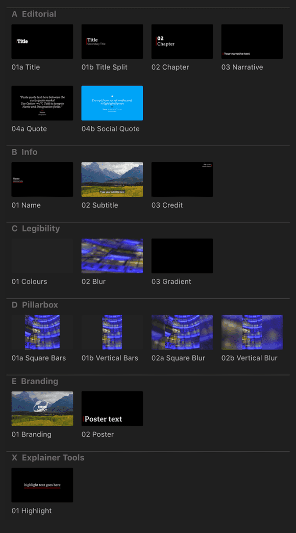
Like I said the timing was good, as the BBC were refreshing their visual identity and had commissioned a new font called BBC Reith which they had already incorporated into some spiffy new narrative text designs and animations.
I’m glad I mentioned animation, I had almost forgotten about that particular pain point — we’ll come to that in a bit. But first let’s breakdown our monumental task into smaller les daunting pieces.
There were three of us working under Bad Idea Factory umbrella on this project, Laurian Gridinoc — overengineer extraordinaire, Piotr Fedorczyk — designer, developer, perfectionist, unicorn — call him what you want but make sure you use a decent font and get the line-spacing just right! And me — the lowly project manager who gets to deal with all the boring stuff — the writing of this blog post being the highlight of the entire contract for me. The BBC News Labs side was headed up by Pietro Passerelli — a fellow OpenNews fellow along with me and Laurian and a keen advocate of timed-text technology and organiser of the TextAV meetups.
So now that the band was back together, we were off to the races (to mix metaphors somewhat). Architecturally we decided to attend to the text generation separately from the text styling and animation. Since different people were working on each of these tasks, we opted to cobble together a type of sandbox where the designer/developer (desigineloper?) could come in and add styles with CSS, untroubled by the various machinations that occurred to generate and layout the unstyled text. Of course, no system is born perfect, so there was a certain to-ing and fro-ing as it became clear that the layout would need to be tweaked in order for styling to be reasonably applied. Which would have been fine, if it wasn’t for all the different permutations and our collective somewhat obsessive nature. Stares at Laurian.
Let’s talk about those permutations for a moment. The BBC have to cater for a number of devices — mobile, tablet and desktop — and so the text needs to be positioned accordingly for each of those targets. Add to this the various different positions and combinations of styled text and we ended up having to style 19 templates — each with slightly different CSS and markup.

It should be noted that it was extremely important that the web-rendered Narrative Text was faithful to the burned-in versions if it was going to be seen as a viable alternative. No pressure then!
Luckily we could take advantage of open source libraries to help us along our way, imscJS was one of these libraries — IMSC stands for Internet Media Subtitles and Captions which is a profile of TTML 2 — essentially what imscJS provides is a way to render TTML to HTML.
It’s fairly important to know that IMSC restricts some of the TTML features, for example there is no support for overlapping regions.
Those of you paying attention will remember that we are converting the XML generated by Final Cut Pro X (FCPX) into TTML, it’s worth attaching a small note to this — if plugins have been used to create the template, the FCPXML can contain references to these plugins, in our case Apple Motion effects. Referenced from within the XML — these manifest themselves as a link to a location on the user’s local environment — which makes it super-important that we have the same setup as the user, and actually that all users have the same setup (as far as FCP plugins are concerned). Caveats – we've had a few.
Apple Motion effects files contain information related to the positioning, font size, colours and default values for all of the above.
Measure Twice, Cut Once
The requirement to animate text on a line by line basis meant we needed to figure out a way to split text for all the various weird and wonderful permutations.
How do we know where to split the line? Well, short of submitting the original FCP versions to an Optical Character Recognition algorithm we’ll need to measure.
In our case, measuring involves creating the text in a container which is handily positioned off to the left of the screen. First we insert one word into this offscreen container to establish the height, at which point we proceeded to add the words back in, until the height of the container changes. When the height changes we know that the text has overflowed and so the words that make up the first line. We repeat the exercise with all text content until we have established all our line breaks.
Of course whenever the media player is resized we need to recalculate the box that contained the text. As media aspect ratio was known (regular 16:9, square 1:1 and vertical 9:16), if (say) a user chooses full screen view and the screen does not match the aspect ratio, the actual media will have black bars — that black bar rendering is internal to the video player, so we had to allow for it to scale the text properly and position it correctly.
It‘s worth noting that although we tried to stay faithful to the original FCP generated Narrative Text, occasionally we would hit upon a case where lines broke at different points to the original — this was usually due to a subtle kerning difference present in FCP type which was unfortunately not recreatable on the web. So many moving parts!
Wheels Within Wheels
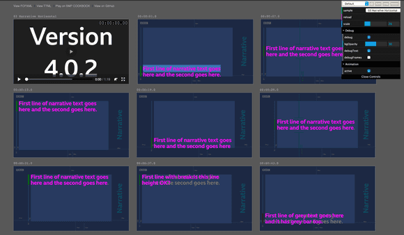
As touched on earlier, we ended up creating a system (within a system) intended to promote and ease workflow around the separation of style, content and to a lesser extent structure. This sandbox afforded our designer a certain amount of freedom and autonomy and had the additional benefit of being a useful acceptance testing tool.

We called this the Playground, but thinking back to my childhood we missed a trick by not calling it the Play School.
Safety Nets
Clearly only the foolish would attempt such a feat without some kind of safety net. Our safety net was to use the off-screen trick for screen-readable narrative text — instead of the on-screen text. In other words, we'd have virtual Narrative Text. If this sounds like a cop-out — that's because it is. We wanted to show that reading the on-screen text was in theory possible, which we did, but also wanted to leave the other option on the table. The most important thing was the accessibility part — if for whatever reason the on-screen text didn‘t seem accurate enough or exhibited other issues, then the BBC could still provide accessible Narrative Text using the off-screen method. Hurrah!
Timing
As it turned out there was another issue that we hadn't forseen — timings. At times the text disappeared from the screen before having been fully read. This caused some of the screen-readers we tried to stop reading. Even when this wasn‘t the case, when the next piece of text appeared on screen it would interrupt the previous. Queuing is possible (in theory) although you‘d have to interleave the narrative text with captions and you‘d lose the sense of pace.
We tried to address the issue by allowing the text to linger after it had disappeared from the screen, leaving time for the screenreader to finish. We could also adjust the start time, adding text to the screen before fading it in. We tested at default read speeds and generally those measure helped, however some may mitigate this issue somewhat by setting a faster reading speed.
The recommendation I would personally make for general audio and video accessibility is to allow playback rate to be adjusted. This is a standard method in all browsers now and so is generally straightforward to implement, but is sadly a piece of functionality that many media players lack.
What we Learned
We knew this was a difficult project from the start and that's what made it a Bad Idea (TM), but all told, we were very happy with the outcome. There was scope for more fine-tuning, but we managed to demonstrate that we could make Narrative Text accessible and provided the tools to do so.
We learned that there are a number of screen-readers — their compatibility varying depending on operating system and browser.
We learned that it‘s almost impossible to keep fidelity with Final Cut Pro X‘s text rendering as you at the mercy of their rending engine which it turns out is subtly different to that of browsers, especially when it comes to kerning.
Finally we learned that it‘s OK to use old and very unfashionable technology (such as XSLT) if it solves the problem — in other words there are advantages to being old (school).
By Mark Boas and Laurian Gridinoc